Any feature that makes easy to be in touch with you brings more customers. Tap-to-Call feature in your mobile website makes it easy for your customers to call you. Unlike desktop version of the website where visitor needs to lookup on your website and dial from a telephone or cellphone, they can simply tap on your phone number on your mobile website which will dial your phone number with confirmation. No need to type or remember your phone number. We can place the Tap-to-Call feature button in contact us page and on all pages prominently in order to encourage prospective customers/clients to contact you. You can see in picture shown here how tapping on the telephone number is prompting to confirm before dialing automatically. |  |
 | If your company doesn't have an official cellphone, it is the time to buy one now. Tap-to-SMS feature makes it easy for your customers to send text message to you. Unlike desktop version of the website where visitor needs to type your telephone number on their mobile by looking into the desktop version website, they can simply tap on the SMS icon on your mobile website and start typing the SMS text. You can see in picture shown here how tapping on the SMS icon automatically took to SMS app and put the cursor in the text area. |
In normal website, you typically publish your location's map with directions from major roads near by. However, in Mobile version, you can show directions from the visitor's current location dynamically. Visitor can either enter the starting address OR choose to use current location option and get driving directions to your place. This feature makes it easy for any one visiting your office, especially for the first time. Getting directions from the visitor's current location is very convenient especially when the visitor is outside his/her home/office. This may even reduce the call volume enquiring driving directions. |  |
 | We generate QR code with your business contact info and include it in the contact us page so that it is easy for your website visitors to point their mobile and scan it in a click and get the contact info added to their contacts quickly. |
Search engines think the content on the main website and the same or similar content on the mobile website is duplicate and halves the rank between both unless proper signals are given to search engines. We design the pages and setup the hosting with proper signals so that search engines do not penalize your website, in fact gets good rank for mobile website. This is not normally done by web design companies, but we do.
robots.txt is a text file which contains instructions to web robots on which files and folders can be indexed or excluded, etc. We generate robots.txt file for all mobile web sites that we design. This is not normally done by web design companies, but we do.
Sitemap contains details of all the web pages on your mobile website. We generate mobile sitemap in XML for your mobile website so that search engines such as Bing, Google knows which web pages to index on your mobile website.
 | 99% of the websites contact pages are not optimized for search engines. While search engines read the contact/mailing info on that page, it doesn't really map to the proper address, since it is nothing but some text. In our mobile website design methodology, we publish this info in the right way so that search engines recognize it as proper mailing address, telephone number, contact person name, email, etc. |
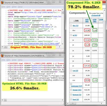
The data speeds on mobile network are not as fast as broadband. The bandwidth costs on mobile networks are a lot higher than regular broadband. Unless your mobile website is optimized, it costs more for your mobile website visitors and also takes more time to download and increases the chances of going away from your website before it loads. Our mobile website design methodology includes optimizing the web page, remove anything that is not needed. We also optimize all resources used by that web page such as stylesheets, javascript files, etc. This will make the website to load fast. |  |
Our mobile website design process includes optimizing all images for best viewing and size since we know the web page load speed is extremely important. This will make the website to load fast.

In addition to optimizing all files, we also compress web pages, javascript files, stylesheets so that the total download size would be less than 30% of original files, and saves any where between 60-70% bandwidth, that means it loads many times faster than the original web page.
 | We use XHTML which is less forgiving for mistakes and gives more consistent user-interface across browsers since all the mistakes are addressed at design time. Search Engines like sites which has zero errors. |
We use Unicode encoding which supports Asian languages as well. In future when you want to add some content in non-English languages, you can simply type the text in those languages, no other design changes are needed. The combination of XHTML with Unicode encoding leads to error free website and less maintenance costs. |  |
Our competitors just publish contact info in the contact us page, which is not recognizable by search engines. We provide feature rich Contact Us page with many convenient ways for the visitor to contact you there by increasing the chances of attracting more customers. Some of the features include:
|  |
 | Responsive web design methodology allows to have a single website to respond to both desktop and mobile websites as appropriate instead of having a separate website for mobile devices. This methodology has its own advantages and disadvantages and we use this methodology if it is appropriate for your website otherwise we use separate domain mobile website strategy. You can see in the picture shown here how the same URL is showing the web page in different formats for desktop and mobile devices. |
Our architecture detects whether the website visitor is connecting from a desktop or mobile device and automatically redirects to appropriate website or respond with the web page appropriate for that . E.g.: If a visitor connects to your desktop website from a mobile device, the visitor will be automatically redirected to the same page on the mobile website OR (If responsive web design method is used for that website) the server will serve mobile page for that visitor's request on the same URL. You can see in the picture shown here how the web server automatically redirected iPhone to the same page on the mobile domain. |  |
 | Based on your requirement, we can prevent text selection and copying in the mobile browser to protect from easy copiers. |
Slide Show is a great feature which shows a picture and caption. A timer can be set for the slide show so that it rotates every few seconds at a faster or slower pace. Visitor does not need to do anything to watch the slide show.
Using Accordin feature, as shown in the picture, lot of text and images can be shown in a small space. When one of the title bands is touched, the section opens up showing the text and images in that section; it also closes other sections (if any section is open) at the same time. When another section heading, say second section is touched, the first one closes up and the one touched opens out. You can see in the picture shown here how tons of information is laid out without cluttering the screen. |  |
 | Based on your requirement and design, we can either automatically increase the font size when visitor changes the mobile device direction to landscape/horizontal mode and decrease the font size when read in portrait/vertical mode OR keep the text size constant in both modes. You can see in the picture shown here how changing the text size remained same in both portrait and landscape modes. |
You can choose to include social network icons something similar to the picture shown or in other format based on your specific website design. This feature allows to spread your website on to social networks. You can see in the picture shown here how social links and very important contact/navigation links are shown in a bar in the footer of the web page. |  |
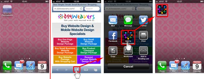
This is something like favorite icon for desktop. When the visitor adds to home screen as shown in the picture, this high resolution icon.